In a series of tweets in January 2012, Kanye West announced the formation of DONDA, a design company named after his late mother. “I want to put creatives in a room together with like minds that are all waaaay doper than me,” he said on Twitter. “We want to help simplify and aesthetically improve everything we see hear, touch, taste and feel.”
Over the course of the last two years, the group has tackled film, magazine covers and stage design, but their most visible work has been album art, primarily for releases on West’s G.O.O.D. Music label. The aesthetic of these covers has hewed closely to West’s initial mission statement of simplicity, bringing sleek minimalism to the racks of Best Buy.
In order to further understand the meaning of the DONDA cover art, we decided to consult three savvy observers: Visual artist Rashaad Newsome, whose hip-hop-centric paintings and performances have taken him from the Whitney Biennial to the Moving Museum in Dubai; Whitney Kimball, a RISD-trained painter and senior editor of New York-based blog Art F City; and guerilla comedian Eric Andre, who is currently breaking desks every week for a second season of his deconstructive talk show on Adult Swim.
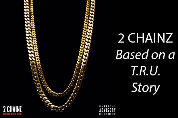
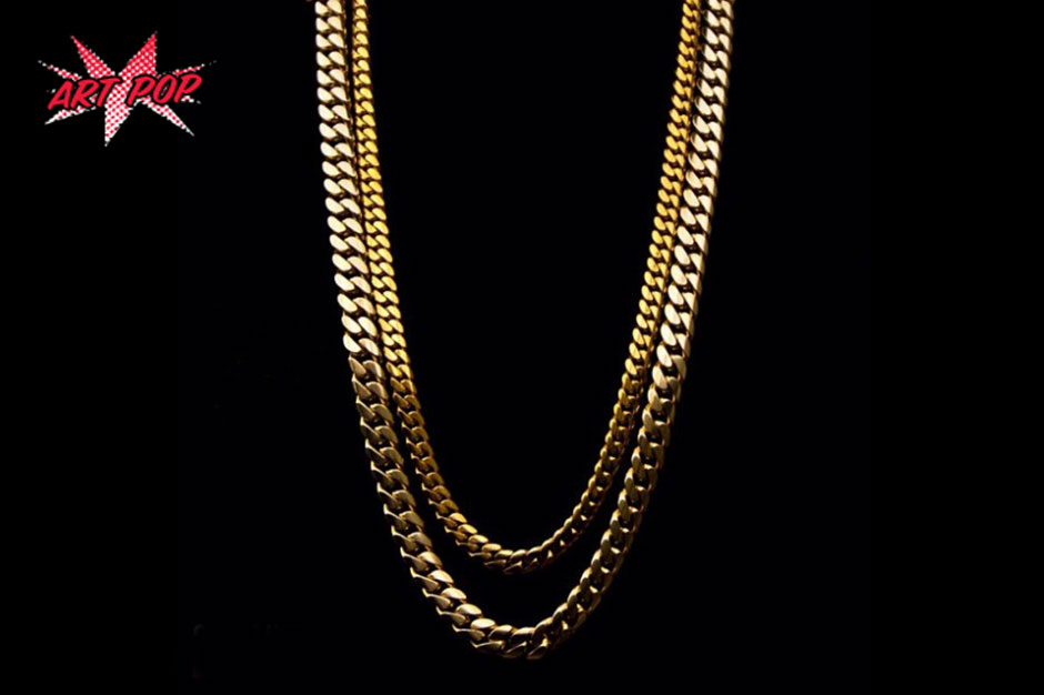
Eric Andre: I like it, man. Minimalistic. He’s got a very simple design: just two chains. I think it’s cool. He has the song where he says, “Two chains, four bracelets.” I thought about having my rap name be 4 Braceletz. Maybe I could open up for him.
Rashaad Newsome: This one is pretty cool; it’s very literal. The cuban link is one of my hallmarks. I use it to create a filigree pattern, like from the Renaissance era. I use it in my frames a lot. It’s my version of a baroque ornament.
Whitney Kimball: This is an ad. No art reference.
Andre: I’m a big 2 Chainz fan, I love his style. I saw him at the VMAs and he was dressed like a couch.

Also Read
GEAR THAT MADE THE GAME: Rap Machinery
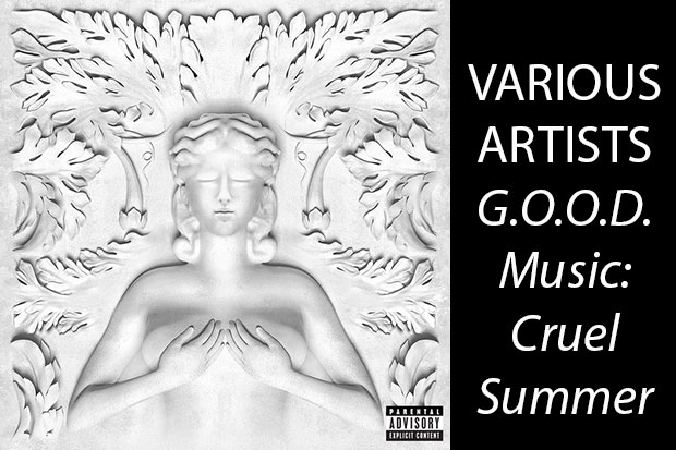
Kimball: A busty Greco-Roman statue! Straight outta Jeff Koons’ playbook.
Newsome: I’m not really a fan. I’m a huge fan of that album. But this one is so boring.
Andre: I like it. I kind of wish I could see a little nip-slip on this Starbucks-angel-mermaid woman. I would like to maybe suggest a little graffiti on there. Maybe [Kanye] graffitis on some eyeballs and maybe a boner creeping in at the bottom of the frame.
Newsome: I feel like if he wanted to do this style he should’ve had me do it. This is a little too close to the reference point he’s working from. It’s not going anywhere new. It could be pushed so much further.
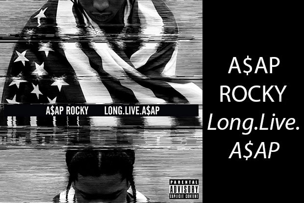
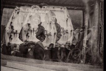
Andre: I like this kind of VHS glitch. It reminds me of my childhood and messing with my mom’s TV. I don’t know what he is looking at, maybe he ran over a pigeon in his car, pulled over, draped an American flag around him and he is looking down at the pigeon? Maybe he is reenacting Pearl Jam’s “Jeremy” video.
Kimball: I like the use of video distortion here to look violent, probably because it reminds me of Pipilotti Rist’s 1986 video, I’m Not the Girl Who Misses Much. Rist sped up and distorted a video of herself dancing so much that the distortion seems violent, and it reads as a feminist statement. Artists have been using distortion for decades, though, so any connection would likely be random.
Andre: I’m a big A$AP Rocky fan and I heard he smokes really quality weed.
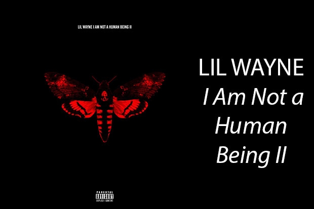
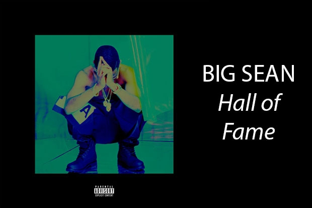
Newsome: I’m from New Orleans and I’m such a big Lil Wayne fan, but I hate this album cover. It’s so wack. It’s such a huge disconnect between the artist, the music, and the cover. It’s like the moth from Silence of the Lambs or something?
Andre: It reminds me of a Björk album cover. It’s interesting, I don’t know, maybe he is saying, “I’m not a human being, I’m a moth?” Maybe he is saying, “I’m going to be reincarnated as a moth.” He is predicting his reincarnation animal. I don’t know what I want to come back as. Maybe as a giant squid, because I still kind of don’t believe they exist.
Kimball: In 1953, the young Robert Rauschenberg erased a Willem de Kooning drawing. Coincidence? Yes.
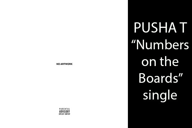
Newsome: I totally don’t like this. This is such a missed opportunity. That’s pretty wack. I like Pusha T, though.
Kimball: If I saw the “no artwork” CD or album I’d pick it up and I think that’s an interesting design choice. I don’t know if this fits more into the minimalism conversation. I see this more in a pop-art conversation and that’s just trying to make something as eye-catching and flashy as possible. Like, if you look at Warhol’s prints, it just happens that making something simple is a way of making something visually strong.
Andre: I also like this one because CDs are now more irrelevant, so it has a little bit of a throwback [feel]. I remember System of a Down came out with Steal this Album, based on Abbie Hoffman’s Steal this Book, and they had a similar kind of thing. It was empty, a jewel case with a blank CD with sharpie on it.
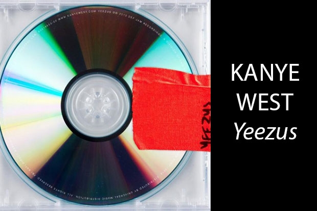
Newsome: This one is pretty awesome. I get what he was doing conceptually. Wasn’t the idea that people got this and then worked on top of it or something? That’s a great idea. What you’re seeing kind of becomes an object and it makes it interactive. Taking out where the artwork is and using the material as the cover I think is kind of interesting. This one is good and that album is really good.
Kimball: It seems more of like a brand-building exercise for Kanye West instead of necessarily distinct artwork. That just comes down to the difference between art and design. Art needs to be independent of a brand and it can’t necessarily be packaged as another idea. The problem with most celebrity art like this is that it’s trying to reinforce the Jay Z or Madonna brand, for instance, when they’re coming into a gallery, which undermines the idea of making artwork in the first place.
Andre: This is my favorite one, it’s like this weird ’90s throwback. It reminds me of like a TLC video.
Newsome: It looks like a Jodeci… which I love Jodeci but…
Andre: It reminds me of Hypercolors, let me make sure its called Hypercolors, it reminds me of my childhood a little bit.
Newsome: This one is so bad. [Like] a bad ’90s album. I have to say that, as a visual artist, when I see some of these album covers and these record companies that put so much money behind them, I’m so shocked that sometimes some of the things that come out. I feel like they should never work with graphic designers. They should always find a visual artist whose work they like and commission them to do something for them. That way it’s not graphic design; it’s a part of history, it’s culture. It’s an actual piece. There are numerous artists who have worked with [visual artists], like when Kanye worked with the painter, what’s his name? George Condo. And Drake’s recent album, I don’t know who painted that, but it’s a good painting. Why would you ever do anything than that?
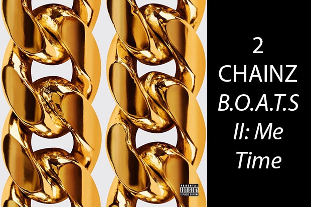
Andre: B.O.A.T.S II: Me Time. That’s something. B.O.A.T.S II: Me Time. It sounds weirder the more you say it.
Kimball: You could compare this to Rashaad Newsome, I guess, since chains are one of his motifs.
Newsome: Of all of them, this might be one of the best ones. It’s not super-innovative in any way, so maybe I just love this chain. It’s nice, you can see the textures of the chain, where it goes from very smooth and polished to where the links get kind of rough.
Andre: It reminds me of Hanukkah gelt. I want to peel off the gold and hopefully there is chocolate behind each of these gold chains.
Newsome: Nah. No, man. It’s like a bad tattoo or something. It’s kind of a really dated [idea]. It’s really overused.
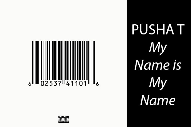
Andre: I think Pusha T should do a show at the MOMA. I wonder if that barcode is really… if it really works at the store, if you could really scan that. I do like this whole minimalist route he is going. I wonder if he is a Philip Glass fan or if he listens to any of those composers.
Kimball: I’d compare [this] to a W magazine cover in which Barbara Kruger superimposed text over Kim Kardashian’s body, which read: “It’s all about me / I mean you / I mean me.” There, Kruger undermined the Kardashian brand in service of an art statement. This talks about the brand, but ultimately it can’t undermine anything; it’s a symbol intended to sell albums.
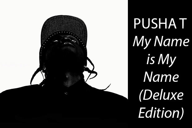
Andre: This is a very interesting picture of Pusha T.
Newsome: I like this one. The way that he’s looking up and because it’s so high contrast, if you were far away from it you might be like, “What is that?” I like that kind of abstraction happening. It just looks really weird.
Andre: I love Pusha T and I love Clipse, I’d love for any of these guys to do my show. Hopefully, they read this article and they waltz right into my studio.
For more, check out VIBE‘s piece: Kanye Has A Dream: Inside His Creative Agency DONDA