The world is about as ready as it’s ever likely to be again for a new Green Day album. A Frank Ocean-length absence following their ¡Uno!/¡Dos!/¡Tré! triptych has eroded bad memories of the overstuffed and underwhelming trilogy — as well as frontman Billie Joe Armstrong’s ensuing public meltdown — while numerous groups who followed in the band’s wake (Blink-182, Fall Out Boy, Panic! At the Disco) have returned to mainstream rock’s forefront. And of course, their last peak also came during a contentious presidential election year, three terms ago: 2004’s American Idiot did its best to make sense of the future of a country likely facing four more years under Dubya’s stewarding. Considering the most prominent stand taken by a rock band against the Trump era thus far has come from Third Eye Blind, we could use Green Day being good again in 2016, for sure.
And the band seems to want to deliver. Talking to Rolling Stone about their upcoming Revolution Radio LP (as well as new single “Bang Bang,” released earlier today), Armstrong theorizes that Trump v. Clinton “is the first time that this election has preyed on fear and anger… nobody can rationalize with each other because everybody is stuck in fear and in anger, and there’s nothing in between,” and summarizes how “in a nutshell, that is what the record reflects.” Sounds good — sounds important. And while “Bang Bang” itself feels more like ’90s Bad Religion than something likely to galvanize the youth of mid-’10s America, there’s a back-to-basics rawness and urgency to it that could roughly be described as “encouraging.” It’s enough to hold out hope for Green Day having one more great, era-defining (or at least era-contributing) album left in ’em.
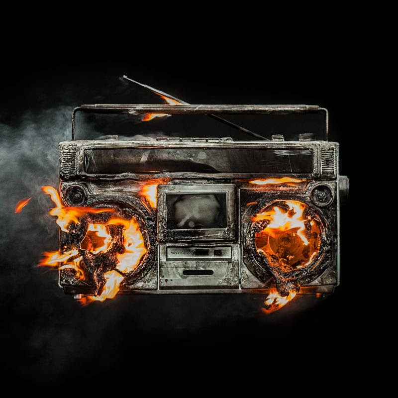
But then you see the album cover, and it’s hard not to feel like it’s already too late. A graphic of the charred remains of a blown-up boombox, the image screams of the kind of counter-culture cheesiness that would’ve already seemed tacky and dated during the (Bill) Clinton years. The record’s title is pretty on-the-nose to begin with — and honestly, when the most incendiary things happening on radio are Hot 97 DJs fighting against getting fired by Drake, maybe it’s time to find a different stage for your revolution altogether — but the artwork represents it in the most literal, uninspiring, PG-13 way possible. It’s punk as interpreted by a Doritos commercial. And choosing to wage war on the cassette-playing, antenna’d stereo currently buried under a pile of outgrown T-shirts in your parents’ attic doesn’t lend a ton of confidence to the idea that Green Day have a finger on 2016’s pulse.
And besides all that… the image just looks bad. Ugly and cheaply rendered, toeing the line between cartoonish and confrontational and falling well short of both. Album art hasn’t exactly been Green Day’s specialty over the last dozen years — 2009’s 21st Century Breakdown looked like phoned-in My Chemical Romance, while the eye-popping imagery of the ¡Uno!/¡Dos!/¡Tré! troika felt as conceptually insecure as the rest of the project. But they’re all The Velvet Underground & Nico compared to Revolution Radio, whose smoke puffs less suggest the aftermath of a Molotov cocktail than an annoying night at a cigarette-saturated bar, and whose faux-flames flicker with the garishness of a Guy Fieri T-shirt.
Still, maybe this is a good thing. Maybe Armstrong & Co. were so single-minded about songwriting and performance this time out that they just decided to leave the marketing to the (wrong) professionals. If we can get 12 songs that mark the beginning of an improbable third golden age for Green Day, the impossibly ill-advised art for Revolution Radio will be forgivable. But if the cover is generally reflective of the music inside, we may find out we never knew just how good we had it with “Oh Love” and “Let Yourself Go” after all.


