Last April, the SPIN staff realized we were at a crossroads. With the current state of the publishing industry, we had two choices: 1) To continue to incrementally transition from the old model of a primary magazine and a secondary website; or 2) To completely re-think how a media company should look in 2012.
We decided to re-think.
Using the idea of form and function as a guiding principle, we arrived at solutions for each of our editorial platforms: Web, Print, Tablet, Mobile, Video, and Social.
In print, the new bimonthly SPIN magazine is a place for long-form essays with rich photography. It’s where signals are separated from the noise, and the larger stories are put into proper context. It’s a panoramic look at the culture that surrounds music, with sections that would have traditionally covered music news and album capsule reviews moving online.

Also Read
Compact Discs: Sound of the Future
Based on this concept, we hired cutting-edge print gurus Everything-Type-Company to help re-design the entire magazine. “When we started the project, we actually first dug into the archives at Google Books and surveyed SPIN’s history,” says Geoff Halber, ETC Creative Director. “We were totally struck by the no-nonsense and bold treatment of music journalism, especially from the ’80s/’90s issues. Those magazines struck a certain chord. That was the magic, and that’s what we tried to bring back.”
Check out this sneak-peek video:
The magazine now is, undeniably, a more substantial, higher-quality product overall. It grew from 9” x 10.75” to 9.5” x 12”. The March/April issue is more than a half-pound heavier than the January/February issue — 304 percent heftier. We upgraded the cover from thin glossy paper to a thick matte-finish stock; inside, the paper stock is a mix of glossy and uncoated.
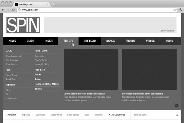
With the changes to the magazine, SPIN.com now becomes the centerpiece of the SPIN brand. The new website will cover everything in a more timely manner, whether that’s breaking news, the latest albums, or interactive content such as streaming music.
With the help of the innovative digital design team AREA 17, we completely overhauled the website. Articles take a sophisticated, print-inspired approach, pairing magazine-quality long-form journalism with eye-catching pull quotes, white space, and large-scale, impactful photographs shot specifically for the site.
“SPIN came to us very early with a vision to move the brand forward by re-embracing its roots. The genius of this oxymoronic statement immediately teased our interest and within a few conversations we knew it was the right path, ” says Andrew Ackermann, one of the partners of AREA 17. “For SPIN to find its place in the new media landscape, it needed to once again foreground music discovery. Print offered one format for the SPIN readership to engage in music discovery, but technology really blew the whole thing wide open by creating a rich dialogue around, not just music, but also the the culture and lifestyle that surround and informs it. Our mission was to stay true to that vision — to create an experience that brings the best of the world of music to your fingertips and to screens in a way that is truly useful, engaging … and, well, fun.”
Drawing from the look of SPIN’s early years in the mid-late 1980s, AREA 17 and ETC worked together to develop a system of fonts, colors, and grids that simplifies and strengthens our overall aesthetic. Now, the SPIN experience will be seamless across every platform.
“Right now is quite possibly the most exciting moment in the last hundred years to be making something — it’s not an overstatement to say that we are in the middle of an industrial revolution.” Ackermann commented, “In many ways, designers are the engineers, spanning great conceptional gaps, often plagued by preconceptions and prejudices about the way things were or should be. SPIN is a brand that obviously lives in a number of mediums but its true existence lies beyond each one of them and is the amalgamation of its parts. In ETC we found true brethren that recognized that the strictures of grid, type and palette enabled each format to have it’s own voice while creating a harmony among all of them.”
And we’re just getting started. As we continue to improve at every turn, you’ll soon see a more engaging mobile web experience and a facelift to our award-winning iPad app, SPIN Play.
We’ve made these changes with you foremost in mind. As always, feedback is welcome. Let us know what you think @SPINmagazine and Facebook.com/SPIN. And the easiest way to subscribe is by clicking here.


